
Date Published: 26-Jun-2012 | By: Nate Rodnay
 Webpage layout is one of the key aspects of usability. An effective layout is all about how well the elements are arranged – in an easy-to-use manner. It should be simple and clean. It should enable the visitor to quickly and easily review the contents. Following are the elements of a good webpage layout.
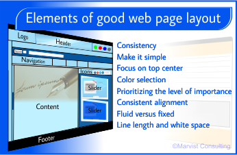
Consistency
A website should have a consistent layout across its pages. When a visitor navigates your website, he feels familiar and connected with the website if all the pages have a consistent layout. If it differs for each webpage, it is likely to leave the visitor confused. He might not know if he is still in the same website or went to another one.
In addition, inconsistency might make visitors annoyed as they have to understand each webpage again from the start. Finding each page as a new website may frustrate the visitor when trying to identify the navigation section.
Make it simple
Make sure not to clutter up the webpages. Avoid packing too much information. Make sure to keep the layout clean and simple so that visitors like your website. A clean looking website contains only the important elements or features arranged in a simple structure. Information will be easier to get as the user has no difficulty while reading the webpage. This also helps the user quickly scan information.
Focus on top center
Many studies on usability show that users tend to look at the top center of the webpage first. Therefore, it is sensible to put all important items such as navigation options and critical content on the top of the webpage. Not only does this help visitors find information, but also grab their attention.
Color selection
As for colors, you can choose one that is preferred by your target audience. Choose colors that give a comfortable feel to users. Avoid using flashy colors that are harsh on the eyes. Websites with dark background do not appeal to most users.
Prioritizing the level of importance
Always place important information on the top and least important at the bottom of the webpage. Users mostly focus on one level of hierarchy at a time. Hierarchical arrangement of information using titles and subtitles makes it easier for users to find the required information in lesser time.
Consistent alignment
Consistency in alignment is a common feature of good websites. Make sure to have a standard alignment – the same color for all headings, another color for sub-headings, standard formats for paragraphs; line spacing, bullets, fonts and sizes, etc. Properly arranged information eliminates readability issues and gives well-organized look to the webpage.
Fluid versus fixed
Choosing between a fluid and a fixed layout actually depends on the type of the website. If you want your website to appeal to a wider audience, a fixed layout is recommended because fluid layout suits savvy users in terms of usability. Also, when the webpage with fluid one is viewed in large screen resolutions, the increased line length and whitespace may impair readability and aesthetic appeal of the website.
Line length and whitespace
Not having enough whitespace on the webpage indicates that the website is cluttered up. However, too much whitespace is also not recommended as it interrupts the flow. Similarly, you have to adjust the line length. Choose a line length based on the font type and font size.
Taking care in line with the points just discussed will help you create a good page layout and its benefits.
You may also like to read:
Things to Consider When Designing Navigation for Your Website